Hiše Žilavec
A website for a roofing, tinsmithing and prefab-home builder trading since 2008, carrying two distinct service lines and four house models through to a single, clear inquiry path.
- Discipline
- Web Design
- Discipline
- Web Development
- Territory
- Slovenia
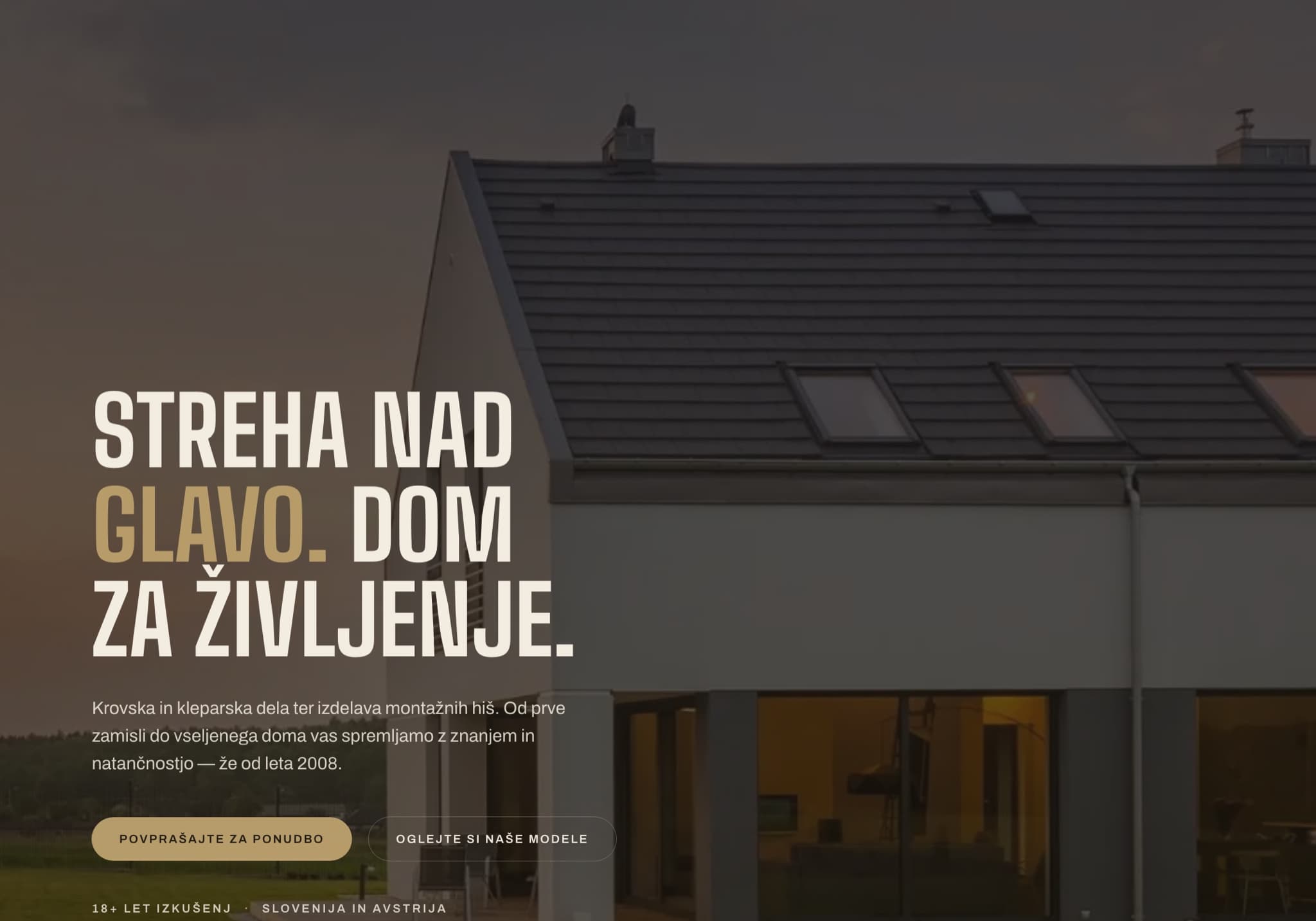
A trade business, online.
Krovske in kleparske storitve, Robert Žilavec s.p. works out of Gornja Radgona and has been trading since 2008. The business covers two related trades: roofing and tinsmithing, and the design and construction of prefabricated houses.
Its customers are spread across north-eastern Slovenia — Gornja Radgona, Kidričevo, Maribor, Ormož, Ptuj, Slovenska Bistrica and Koroška — as well as neighbouring Austria. The site had to serve someone replacing a roof and someone planning an entire house, without asking either to wade through the other’s material.
Five problems to solve.
Two trades, one business
Roofing and tinsmithing sit beside prefab house construction. They serve different buyers with different timelines, and the site had to hold both without reading as two companies stapled together.
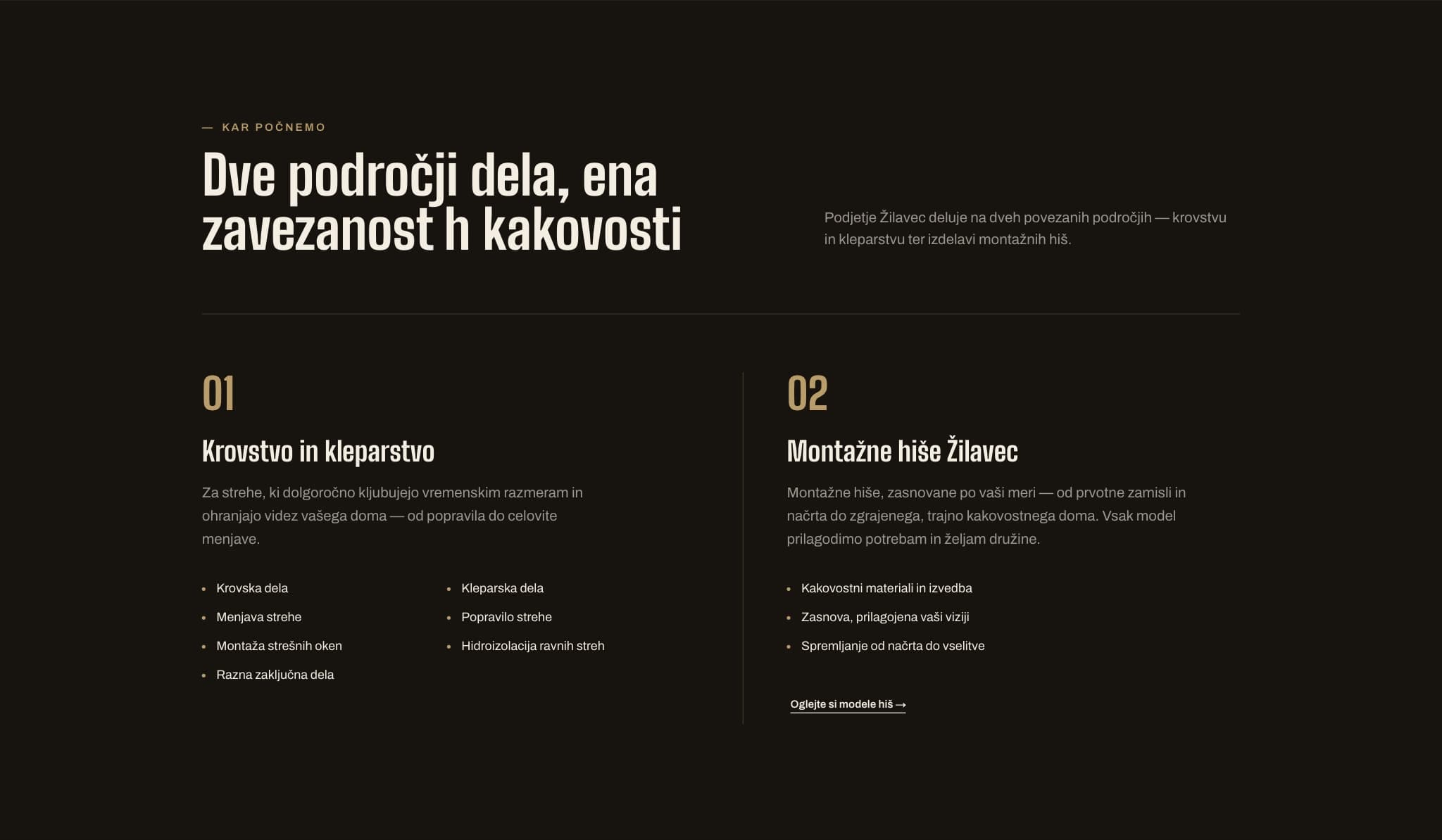
Four models, compared honestly
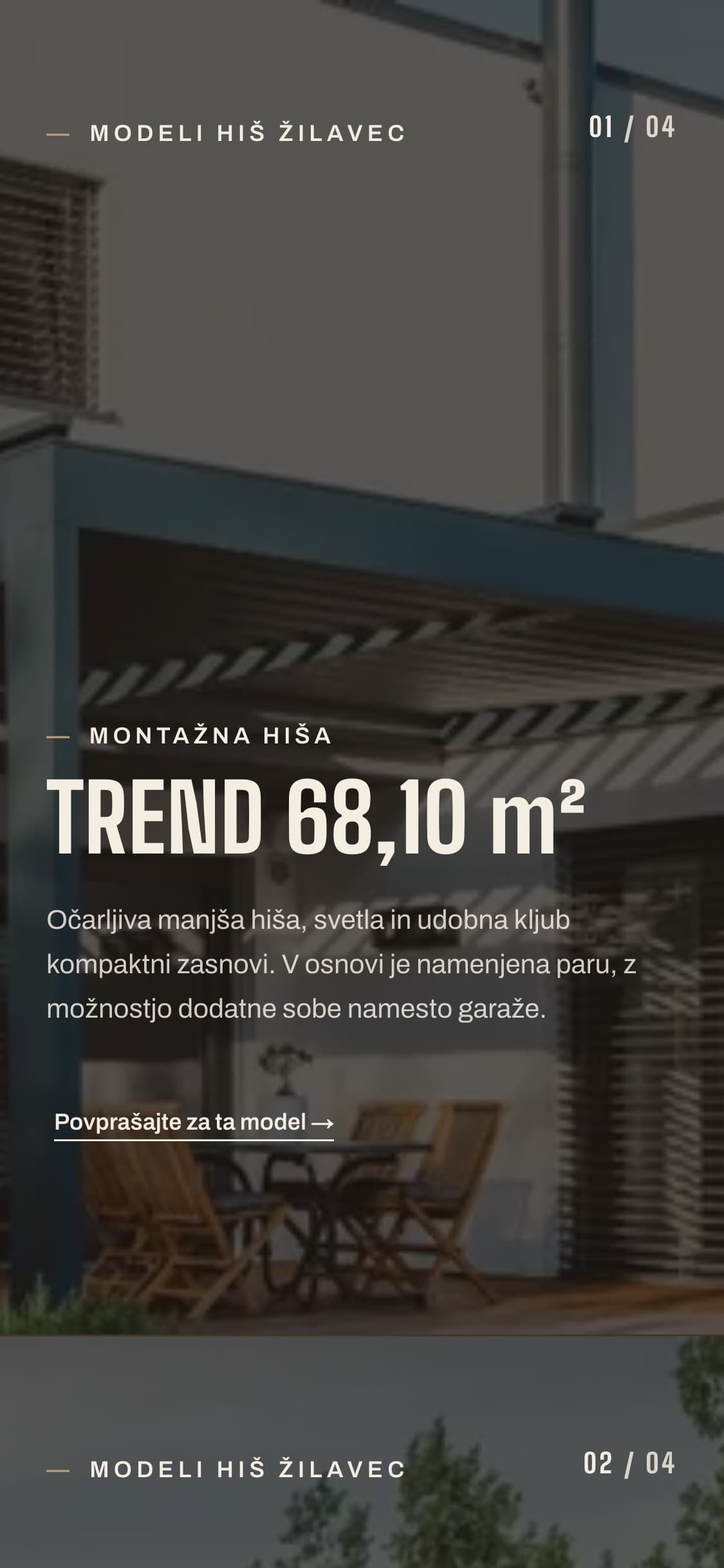
The house range spans 68 to 206 m². Each model needed enough substance to be judged on its own, while staying comparable to the others at a glance.
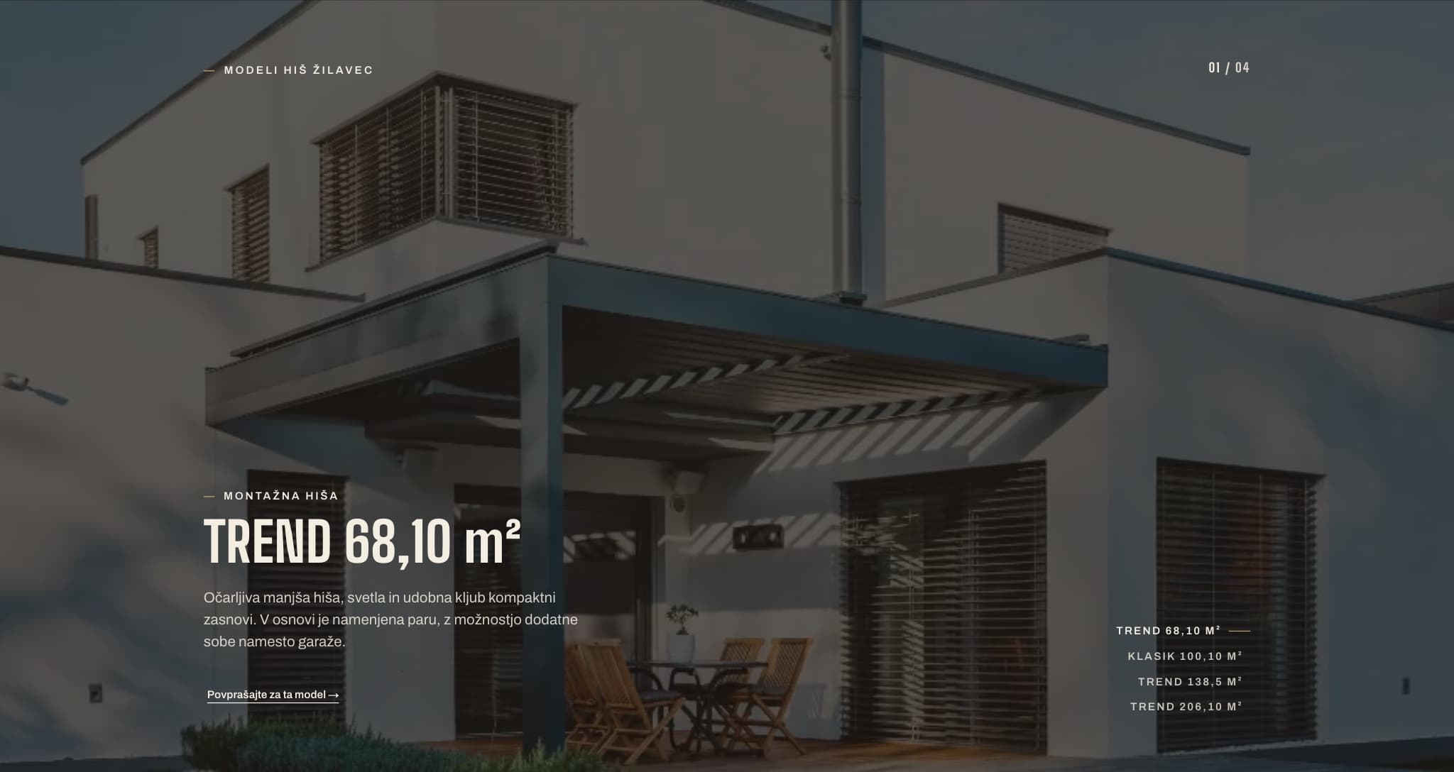
Navigation a roofer can use
The audience is not browsing for pleasure. Wayfinding had to be short, obvious, and reachable from anywhere on the page.
One path to an inquiry
Every route through the site resolves to the same place: a single form that already knows which service or model the visitor came from.
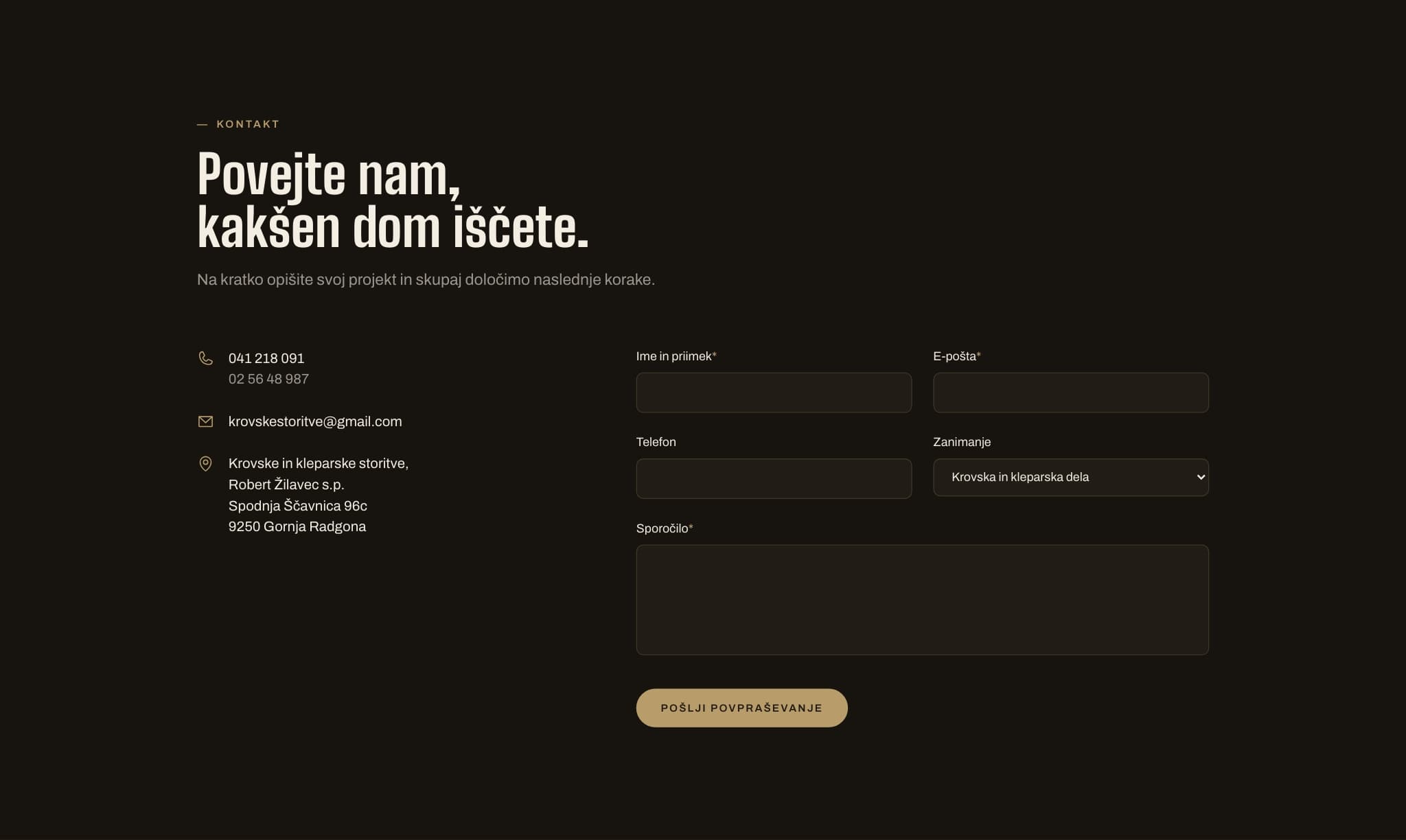
A trade, presented well
Eighteen years of craft deserved a digital presence with the same care. The work is physical and unglamorous; the presentation had to be calm, dark, and confident rather than loud.
One page, nine stops.
The whole business sits on a single page. Anchors do the work of sub-pages, so nothing costs a page load and the inquiry form is never more than one jump away.
Home — enostranska predstavitev
├── Predstavitev              #predstavitev
├── Storitve                  #storitve
│   ├── Krovstvo in kleparstvo
│   └── Montažne hiše Žilavec
├── Montažne hiše             #hise
│   ├── TREND 68,10 m²        #model-01
│   ├── KLASIK 100,10 m²      #model-02
│   ├── TREND 138,5 m²        #model-03
│   └── TREND 206,10 m²       #model-04
├── O nas                     #o-nas
└── Kontakt                   #kontakt
└── Povpraševanje — obrazec z izbiro storitve ali modelaBuilt like the work.
Big Shoulders set uppercase at 700 for headlines — a condensed grotesque that reads like signage on a building site. Archivo carries the body copy, keeping longer Slovenian sentences even and legible.
A warm near-black ground with a single brass accent, interrupted by one paper-toned section. The palette stays out of the way of the architecture.
Full-bleed architectural photography under a dark wash, thin rules, and generous margins. Structure carries the page rather than ornament.
Built work shot at dusk, when a finished roofline reads as a silhouette and the interior lights are on. The subject is always a completed house, never a stock interior.
Two typefaces, five values.
Big Shoulders
700, uppercase. Condensed enough to hold a long Slovenian headline on one line.
Archivo
400–500. An even, unfussy grotesque that keeps diacritics clean at small sizes.
Ground
#17140F
Page background
Ink
#F3EDE2
Text on dark
Brass
#B89D6B
Accent and calls to action
Paper
#F5F1E7
Light section
Contrast
#201B14
Text on brass
Designed from the smallest screen up.
Most visitors arrive on a phone, often from a job site. The narrow layout was the one designed first; the wider ones open it up rather than rearrange it.
Mobile
The primary case. Sections stack in reading order, the house models become a swipeable sequence rather than a grid, and the inquiry button stays within thumb reach throughout.
Tablet
The service pair splits into two columns while the models stay full width, so a 68 m² plan is never shrunk to the point where its layout stops being readable.
Desktop
The hero takes the full viewport and the type scale opens up. Margins widen rather than the measure, so body copy keeps its line length instead of stretching.
What it is actually built on.
Next.js
App Router with server-rendered pages, so the site arrives as HTML for search engines and slow connections alike.
TypeScript
House models, services and form options are typed data rather than duplicated markup — adding a model is a data change.
Tailwind CSS
A single token set for colour, spacing and type, which is what keeps the dark and paper sections consistent.
Framer Motion
Entrance reveals and the model sequence, held to opacity and small offsets, and suppressed under reduced-motion.
Vercel
Deployed on Vercel with the contact form wired to the client's own inbox.
Two service lines and four house models, resolved into one page and one inquiry.
The site is live and in use by the business, with the contact form running to the client’s own inbox.